A heart on a ring, a spade in black enamel, a tiny die hanging from a bracelet: card-suit motifs are among the most recognisable shapes in jewellery, and they got there for a simple reason. They are small, graphic and instantly read, which is exactly what a jeweller needs from a symbol that has to work at the scale of a fingertip.
Jewellery has always borrowed compact signs: hearts, stars, knots, insects, initials and coins. The suits of a pack of cards belong in that tradition. Worn rather than played, they stop being part of a game and become pattern, memory and a quiet piece of visual history.
A Small Language of Signs
Playing cards have carried their own visual alphabet for centuries, and it was never a single one. Yale's cataloguing manual for its playing-card collection records suit signs from several traditions, from the hearts and spades of French-suited packs to the cups of Italian ones and the leaves and bells of German decks. It even keeps a category for transformation cards, in which artists worked the suit signs into pictorial designs so that a heart became part of a face or a landscape.
That long graphic life is what makes the suits so portable. A sign that has already been redrawn by generations of card makers moves easily from paper to enamel, gold, gemstones or engraved silver.
From Painted Cards to Precious Metal
Early playing cards were often far more than disposable objects. The Metropolitan Museum of Art's Cloisters Playing Cards, made in the South Netherlands around 1475 to 1480, form a complete fifteenth-century pack of hand-painted cards, with the value of each pip card shown by repeated suit symbols. When a symbol survives both as game equipment and as a collectible image, it becomes available to designers as familiar visual shorthand.
Fun fact: the Cloisters cards were built from four layers of pasteboard and finished with applied silver and gold. Long before anyone set a spade in pavé diamonds, card makers were already treating the suits as something worth gilding.
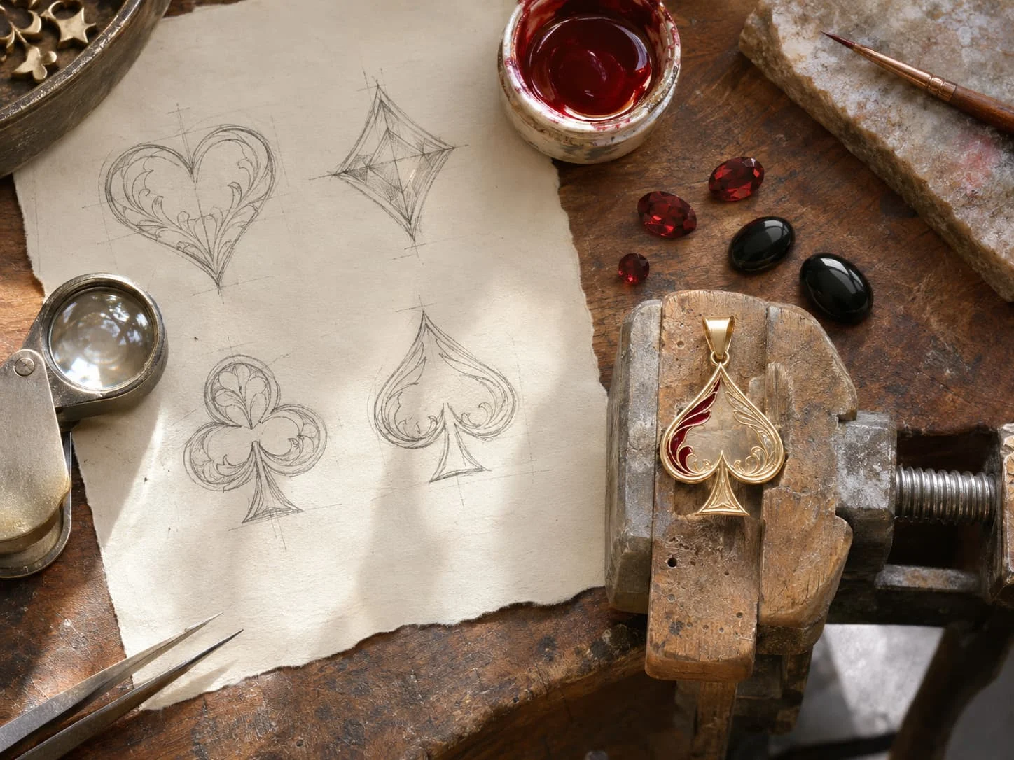
What Each Suit Gives a Jeweller
For a maker, the appeal is partly technical. Each suit offers a different outline, and each outline suits a different technique:
Motif | Its shape | Where it works best |
|---|---|---|
Heart | Soft, symmetrical curves | Pendants and lockets; red enamel or a heart-cut stone |
Diamond | Sharp, four-pointed rhombus | Studs and geometric settings; a natural partner for a step-cut gem |
Club | Balanced trefoil on a stem | Charms and signet details; reads like a classical quatrefoil |
Spade | Pointed leaf with a crisp base | Black enamel or onyx; strongly Art Deco in feel |
Dice | Cube with dotted faces | Bracelet charms and cufflinks; the pips can be set with small stones |
Token or chip | Ridged disc with coloured rings | Borders and textures; the edge pattern becomes milgrain or reeding |
These motifs are useful as design vocabulary in their own right. A heart can be cut as a clean silhouette, a spade gives a sharp line that flatters enamel or pavé, and the ridges and colour rings of a gaming token suggest borders and textures long before they suggest a game.
Why the Meaning Changes on the Body
A card-suit jewel changes the scale and the context of its image. On the table, the symbol belongs to the game; on a ring, cufflink or pendant, it becomes ornament, private association or a conversation piece. That move from idea to object is the oldest story in the craft. The V&A, which began collecting jewellery design drawings in 1877 and now holds more than 3,000 of them, keeps the drawings of Arnold Lulls, an Antwerp-born jeweller who supplied the English royal court from around 1585. Among them is a design for a pendant and earrings with loops in the form of a snake swallowing its tail: another ancient sign, reduced to a few curves and made wearable.
This is the most rewarding way to read imagery borrowed from the casino table: as a set of signs that designers adapt, abstract and refine. A good piece does not need to romanticise chance or suggest luck as a lifestyle. It treats cards, dice and tokens as part of a broader visual archive: crisp, legible shapes that carry history, playfulness and a little graphic tension.
Commissioning a Card-Suit Piece
Card motifs are a natural fit for bespoke work, and Hatton Garden, London's jewellery quarter, is built for exactly that kind of commission. If you are planning one, these are the decisions that shape the result:
The metal. Yellow gold warms a heart or a diamond; white metals and platinum suit the cooler geometry of a spade or a club.
Colour. Enamel brings the classic red and black of the suits; stones such as ruby, garnet, onyx or black spinel do the same with more depth.
Scale. A motif that reads clearly at the size of a playing card can blur at 8mm. Ask to see a drawing or a wax model at actual size.
Subtlety. A ridged token edge can become pure texture, and a single pip can stand in for a whole card. The quieter versions tend to wear best.
The reverse. Engraving a date, initials or a hidden suit on the back keeps the meaning private to the wearer.
Craft Before Anecdote
The same distinction matters in the way pieces are described and sold. A jeweller can talk about a motif's shape, craft and cultural reference without selling a fantasy of risk. The interesting questions are material ones: how enamel changes a suit mark, how a token border becomes a setting, how a small charm balances recognition with elegance.
Handled that way, these motifs become part of design history rather than a slogan. A black enamel spade can read as Art Deco geometry, a red heart can feel romantic rather than literal, and the best pieces leave enough ambiguity for the wearer, which is often where jewellery finds its lasting charm. The motif becomes craft before it becomes anecdote, and craft remains the central story.
Continue Reading
The Hatton Gazette
Delivered monthly to your inbox
Subscribe for the latest from Hatton.